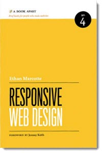
Responsive web design is a current trend among user experience designers and those who work as developers, digital marketers, and others. Ethan Marcotte’s work is primarily aimed at those with a more technical or coding background. His work provides details on how to implement a responsive approach.
Overall, I agree with Marcotte’s approach of using responsive techniques to create one set of code that can serve multiple devices that may be viewing a site. These devices can range from smartphones to tablets to wide screen desktop monitors. He makes an excellent parallel to the constraints that artists have once they decide on a canvas; however, the web designer never knows which sized canvas his audience will use to view her work.
Marcotte break down responsive web design into three main ideas: flexible grid-based layout, flexible images and media, and media queries. In each, he does an excellent job of spelling out the challenges inherent in this task as well as providing examples that include step-by-step code to illustrate his points.
In the final chapter, Marcotte paints a vision for us becoming responsive. He calls out the importance of understanding the user before making design decisions. Namely, one must understand the user’s context as well as their priorities and goals. Marcotte rightly champions the use of iterative and collaborative design to overcome challenges that arise.
I recommend this book to those involved with designing websites and applications. I believe that those who have a more technical background would benefit from it most; however, the principles that Marcotte advocates would certainly benefit others as well.
